Shipped
Oaks Senior Living
Designing for Clarity & Confidence in High-Stakes Decisions
Research, Design, Usability Testing, Project Planning
1 Designer(me), 1 PM, 3 SD , 1 CEO


Overview
The Problem
Despite 37,000+ monthly visitors, Oaks Senior Living’s redesigned site wasn’t converting. Families under time pressure couldn’t find essential information or confidently take the next step.
The Solution
I led a two-phase UX overhaul: a heuristic sprint to fix foundational issues, followed by a research-driven redesign shaped by usability testing and emotional design principles.
The Impact
14%
more qualified leads
25%
Increase in call events
2.6% to 3.8%
Growth in daily usage
4m to 2m
Reduction in form completion time
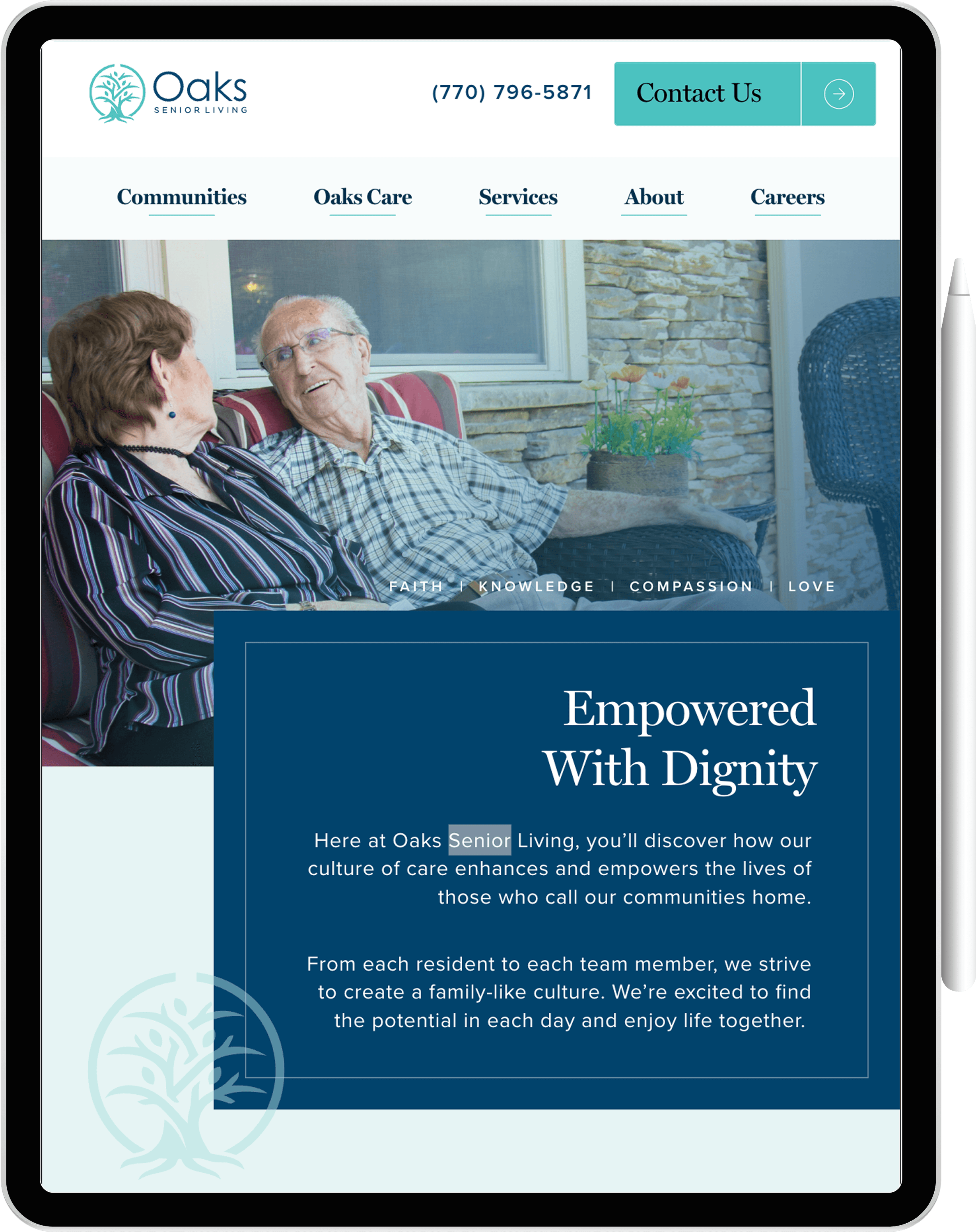
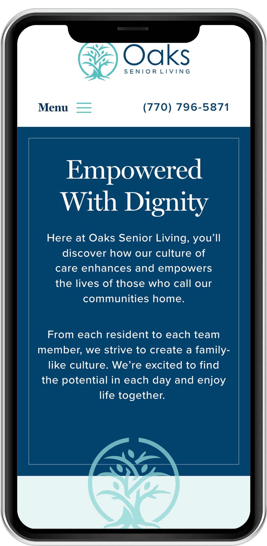
When a Nice Redesign Still Fails
Oaks Senior Living had just launched a new site. It was clean, modern… and barely working.
Despite over 37,000 monthly visitors, families were leaving without calling, booking tours, or even exploring more than 1.8 pages in average
I kept thinking: If I was looking for care for my own parent, would this site help me — or slow me down?
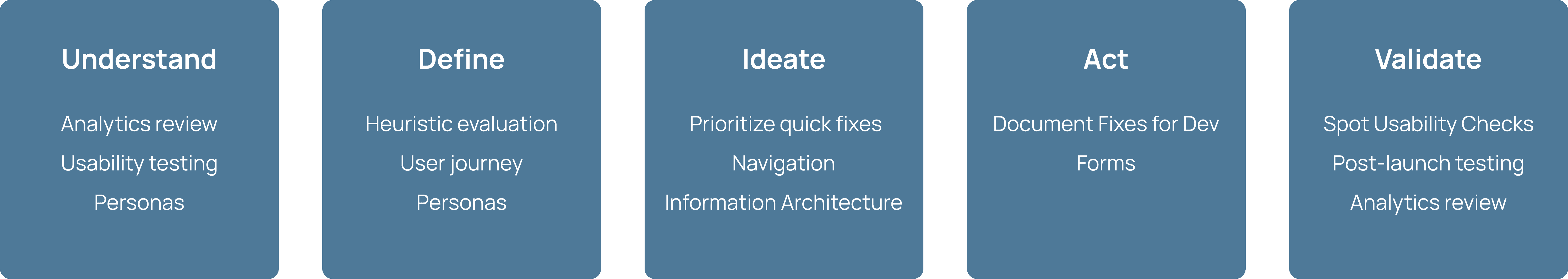
My Process
Two Phases to a Better Experience
We approached the redesign in two phases to balance speed with depth — starting by stabilizing the experience, then addressing deeper structural and content issues uncovered through research.
Phase 1
1.5 Weeks
Foundational Fixes & Quick Wins
Goal: Remove the most visible usability blockers so families could complete core tasks without unnecessary friction.
Phase 2
2.5 Weeks
Research-Driven Redesign
Goal: Restructure navigation, content, and forms to align with real user behavior and the emotional needs of families making high-stakes decisions.
The Problem
Lost Leads in a Critical Decision Journey
Families came to the site ready to take the next step in choosing care — but instead of a clear, guided path, they hit friction at every stage.
Key information was hard to find, comparisons were impossible, and calls-to-action pushed them toward high-commitment decisions before they were ready.
The result? Fewer inquiries, fewer tours booked, and qualified leads dropping off before connecting with Oaks.
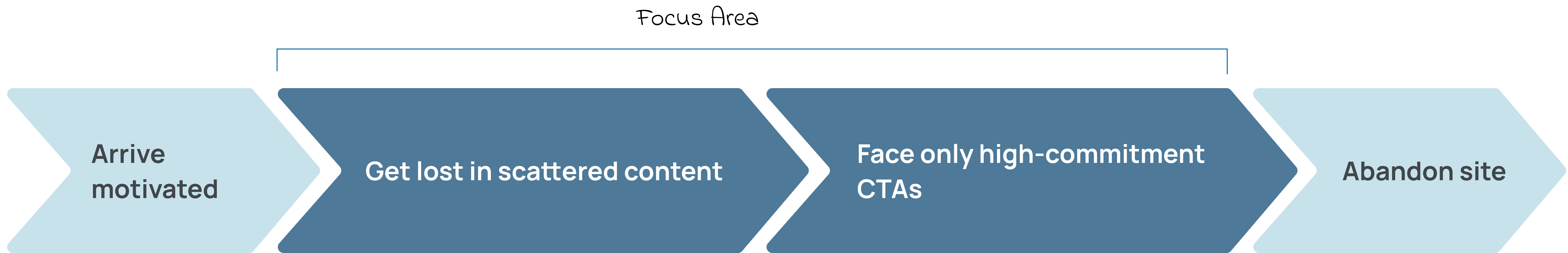
How might we give families urgent clarity, build trust in minutes, and guide them confidently to the next step ?
Research
How I Found the Real Friction
I pulled 90 days of google analytics, walked through every high-traffic path using Nielsen’s heuristics, and then watched real families try to complete key tasks in usability sessions.

Google Analytics Analysis

Heuristic Evaluation

Usability Testing

Journey Mapping


Key Insight
01
Navigation Broke Mental Models
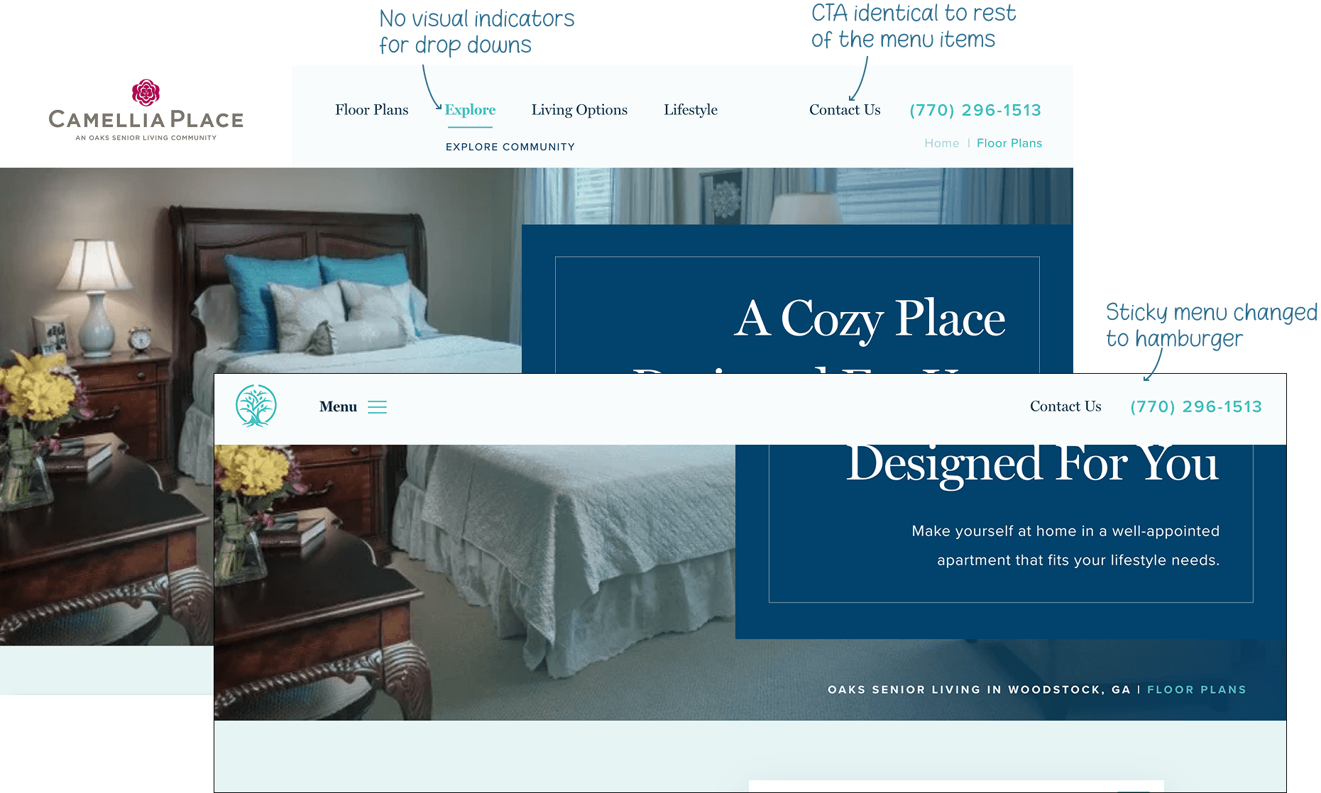
On scroll, the main menu collapsed into a hamburger. The navbar didn’t highlight the current page, dropdown menus lacked visual cues, and the “Contact” button was styled like any other menu item.
02
Forms Created Conversion Roadblocks
A single, generic form tried to serve every inquiry, stretching over 12+ fields. It lacked defined states for active fields, errors, or successes — leaving users uncertain if they were completing it correctly. Many abandoned at this critical stage.
03
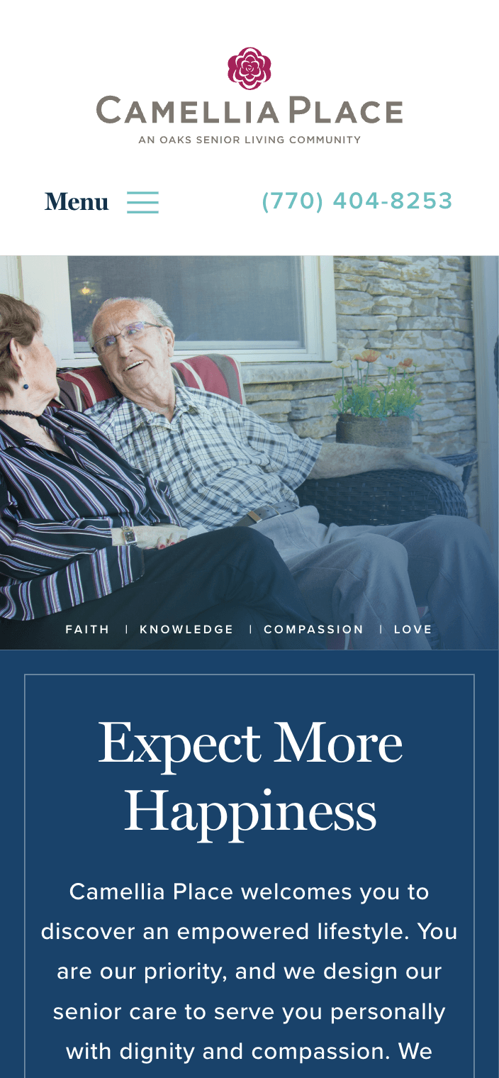
Mobile Users Faced a Desktop-First Experience
With 62.8% of traffic on mobile, the lack of a “Home” button, small tap targets, and long scroll paths made tasks 40% slower and abandonment more likely.
04
Language that was full of fluff
Headlines were casting a vision, but were useless. People couldn’t tell what Oaks offered without actually reading through paragraphs of text.
01 Made Headings Scannable
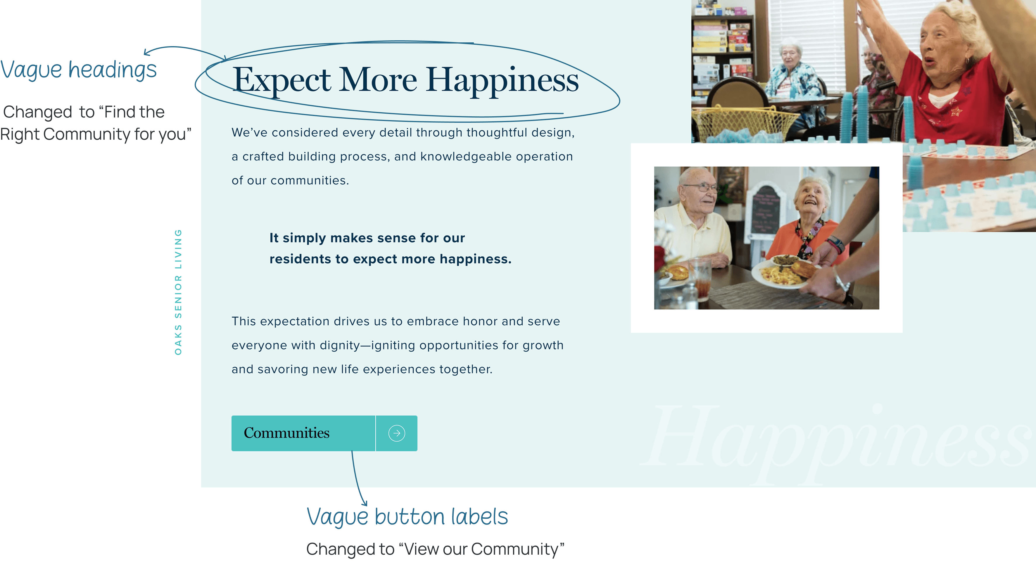
Problem: Marketing fluff forced users to read instead of scan, creating friction during stressful care research.
Solutions Implemented
Replaced storytelling headings with scannable, keyword-rich alternatives
Updated vague CTAs to be action-oriented : "Communities" → "View our Communities"
Prioritized user-friendly language over brand storytelling
Impact: Reduced cognitive load and improved content comprehension for families under stress.
02 Navigation Improvements
Problem: Navigation inconsistency was breaking user mental models and hiding conversion opportunities.
Impact: Eliminated user confusion and improved accessibility compliance.
Solutions Implemented
Maintained navigation consistency across sticky and standard states
Styled the Contact CTA similar to the other primary buttons
Added dropdown indicators with clear arrow icons
Improved contrast ratios to meet WCAG accessibility standards
Before
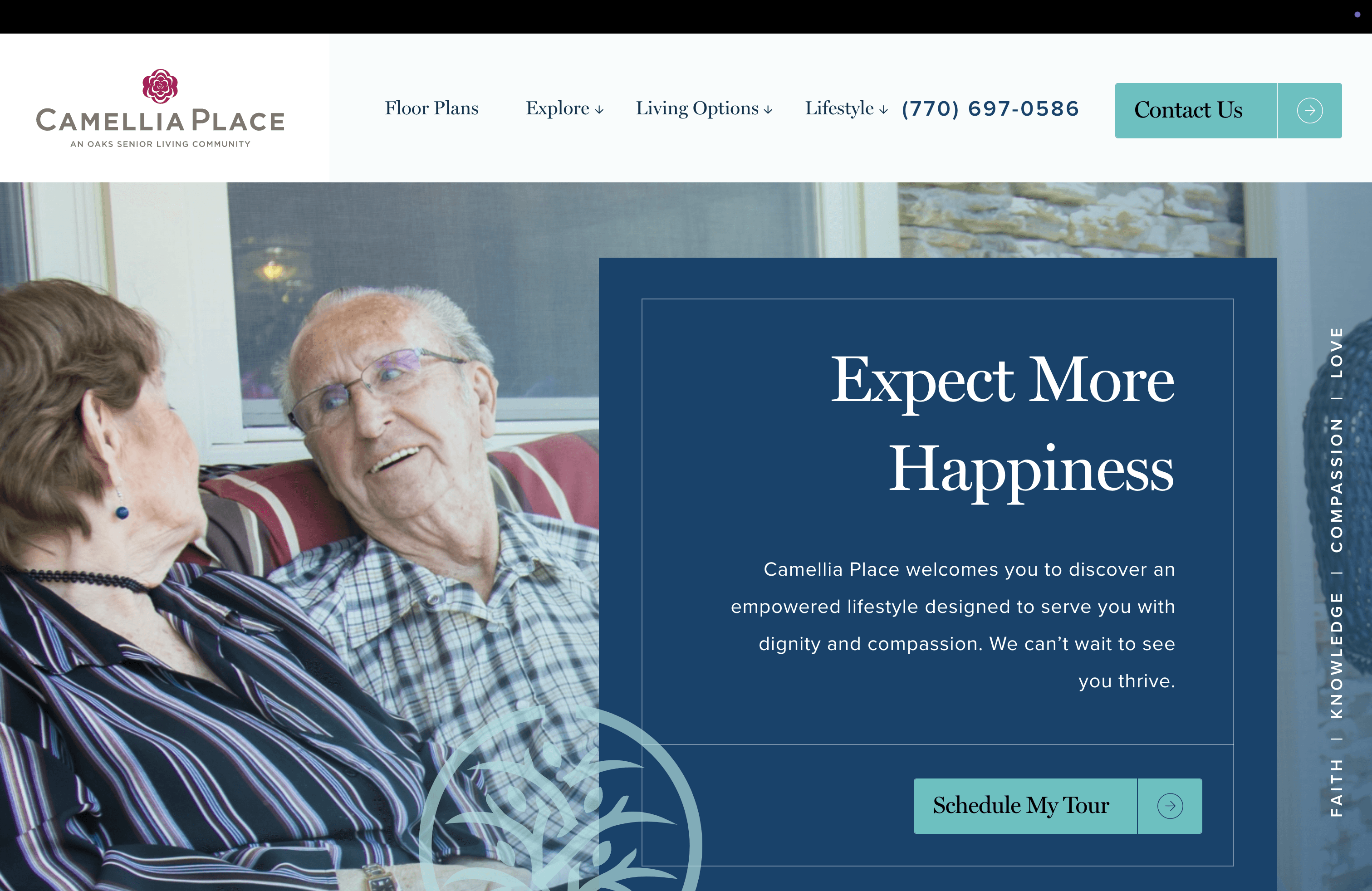
After
03 Reduced Form Friction points
Problem: "Contact Us" and "Schedule a Tour" CTAs led to the same generic form, violating recognition vs recall heuristics and misleading users about intended actions.
Solutions Implemented
Separated tour scheduling from general contact forms
Reduced form fields from 12 to 6 essential fields using progressive disclosure
Added distinct form field states (hover, active, focus) with proper contrast
Added real-time validation to prevent errors and provide clear error correction


04 Mobile Experince optimization
Insight: 62% of our users were using the site from mobile.
Solutions Implemented
Standardized text sizing for better readability
Made buttons full-width, creating a larger touch target
Disabled distracting animations on mobile

05 Enhanced Care Level Communication
Strategic Innovation: Created decision-support framework rather than just informational content.
Solutions Implemented
Daily Life Scenarios: Concrete visualizations reduce abstract anxiety
Family Success Stories: Social proof reduces perceived risk
Anticipatory FAQ System: Proactive answers to unstated concerns


06 Floor Plans Redesign
Problem: Analytics revealed that floor plans were the most visited pages, but they only showed basic room types without the context families needed for informed decision-making.
Solutions Implemented
Added room-specific amenities and detailed specifications to help families visualize daily life
Indicated which care levels each room type serves with visual badges and descriptions with filters
Added dedicated sections showcasing safety measures and service features unique to each community
Moved gallery from hidden "Explore" section to prominent placement, making visual discovery effortless

Key Learning & Reflection

Clarity is confidence
In senior care, unclear navigation isn’t just a UX bug — it’s a reason to doubt the whole organization.
Show, don’t tell, to stakeholders
A single video clip of a user failing to understand care options did more to secure IA changes than any metric.
Mobile is the primary experience
If you’re not designing for mobile-first here, you’re designing for no one.
Analytics + observation
Data told me where people were dropping. Watching them told me why.